Oscar Salazar • Monday, August 15, 2022

AUTHOR
OS
Oscar Salazar, Senior Software Engineer
Oscar is a Software Engineer passionate about frontend development and creative coding, he has worked in several projects involving from video games to rich interactive experiences in different web applications. He loves studying and playing with the newest CSS features to create fantastic art.
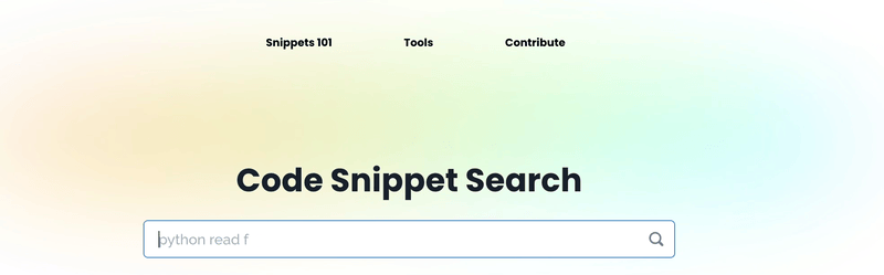
Using React to build beautiful color animations in HTML Canvas and CSS
To dig into the snipt.dev animation we are going to talk about frontend animations with canvas and CSS. I will show you how to implement a canvas element in React and animate colors using requestAnimationFrame.
Later on in this post, we will explore how to achieve a similar effect with pure CSS, only using keyframes and background colors.
Canvas animation
Let's start by creating a component with a canvas element. We will use a reference to access the 2D context and start our animation.
import { useEffect, useRef } from "react";
const Background = () => {
const canvasRef = useRef < HTMLCanvasElement > null;
return <canvas ref={canvasRef} width="32px" height="32px" />;
};
Once we have our component we can use the useEffect react hook to start our animation loop.
import { useEffect, useRef } from "react";
const SPEED = 0.02;
const Background = () => {
const canvasRef = useRef < HTMLCanvasElement > null;
useEffect(() => {
const canvas = canvasRef.current;
if (canvas) {
const ctx = canvas.getContext("2d");
let time = 0;
const loop = function () {
time = time + SPEED;
window.requestAnimationFrame(loop);
};
loop();
}
}, []);
return <canvas ref={canvasRef} width="32px" height="32px" />;
};
We now have what it's called an animation loop, this means the browser will render our loop function for as long as our component is mounted on the page.
Always make sure to use requestAnimationFrame, this function prevents your browser from ending in a stack overflow error due to our infinite loop and will only draw frames when the browser is ready. This means it won't interrupt your main application JavaScript execution and won't render when the tab is not visible.
Nowadays most modern browsers support requestAnimationFrame, but if you end up supporting a very old browser make sure to polyfill this method or use a simpler solution like a setTimeout loop.
Alright, now we are ready to start adding some colors!
export const color = function (context, { x, y, r, g, b }) {
context.fillStyle = `rgb(${r}, ${g}, ${b})`;
context.fillRect(x, y, 1, 1);
};
In the snippet above we are getting a canvas 2D context and filling a pixel with the computed color r, g, b at the position x, y. We want to fill each pixel in our 32px by 32px canvas, to do so we will use our animation loop and some functions to calculate our rgb values.
const C1 = 191;
const C2 = 64;
export const color = function (context, { x, y, r, g, b }) {
context.fillStyle = `rgb(${r}, ${g}, ${b})`;
context.fillRect(x, y, 1, 1);
};
export const R = function (x, y, time) {
return Math.floor(C1 + C2 * Math.cos((x * x - y * y) / 300 + time));
};
export const G = function (x, y, time) {
return Math.floor(
C1 +
C2 *
Math.sin(
(x * x * Math.cos(time / 4) + y * y * Math.sin(time / 3)) / 300
)
);
};
export const B = function (x, y, time) {
return Math.floor(
C1 +
C2 *
Math.sin(
5 * Math.sin(time / 9) +
((x - 100) * (x - 100) + (y - 100) * (y - 100)) / 1100
)
);
};
The R, G, and B functions receive a position x, y and a time in our loop to calculate a value between 0 and 255. We start with the base values C1 and C2 and use the sin and cos to create a smooth interpolation of colors.
Now, all that's left is to implement the color function and R, G, B functions in our animation loop.
import { useEffect, useRef } from "react";
const SPEED = 0.02;
const Background = () => {
const canvasRef = useRef < HTMLCanvasElement > null;
useEffect(() => {
const canvas = canvasRef.current;
if (canvas) {
const ctx = canvas.getContext("2d");
let time = 0;
const loop = function () {
for (let x = 0; x <= 32; x++) {
for (let y = 0; y <= 32; y++) {
color(ctx, {
x,
y,
r: R(x, y, time),
g: G(x, y, time),
b: B(x, y, time),
});
}
}
time = time + SPEED;
window.requestAnimationFrame(loop);
};
loop();
}
}, []);
return <canvas ref={canvasRef} width="32px" height="32px" />;
};
Since we want to fill each pixel in our 32px by 32px canvas, we implemented two for loops to go through each pixel and in each pixel, we will call the color function with our desired rgb values. All that's left is to increment our time variable with the speed at which your want your colors to move.
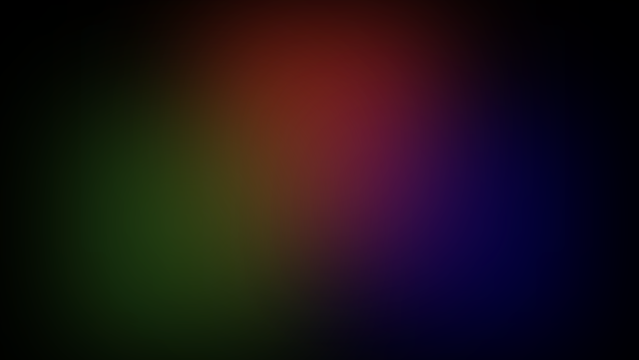
You should have something like this:
Wrapping it up
Canvas helps us render incredible beautiful graphics in the browser but it comes at the cost of extra code and more complex logic to maintain, on the bright side you get full control over what's rendered on the screen and some smooth animations.
I'll leave you with this, for now, feel free to come up with creative solutions to "stretch" and "cut" the canvas so that it renders the color in certain regions only, for example, we used CSS to grow our canvas 100% of the screen and overlapped a div with an inset shadow to create an oval.
CSS animation
With CSS we don't have as much control over each pixel but we can come up with some clever techniques to achieve a similar output without adding extra JavaScript and much simpler code.
Let's start by adding a component with some div elements
const Background = () => {
return (
<div id="container" aria-hidden>
<div id="color-one" />
<div id="color-two" />
<div id="color-three" />
</div>
);
};
As you can see we have a container div and some children in which we will render our colors. We use aria-hidden since we don't care to announce this animation.
const Background = () => {
return (
<div
id="container"
aria-hidden
style={{
overflow: "hidden",
background: "black",
position: "absolute",
top: 0,
right: 0,
bottom: 0,
left: 0,
zIndex: -1,
}}
>
<div
id="color-one"
style={{
opacity: 0.5,
width: "400px",
height: "400px",
background: "red",
filter: "blur(100px)",
borderRadius: "99999px",
}}
/>
<div
id="color-two"
style={{
opacity: 0.5,
width: "400px",
height: "400px",
background: "green",
filter: "blur(100px)",
borderRadius: "99999px",
}}
/>
<div
id="color-three"
style={{
opacity: 0.5,
width: "400px",
height: "400px",
background: "blue",
filter: "blur(100px)",
borderRadius: "99999px",
}}
/>
</div>
);
};
Here are the important bits of the preview snippet, we start off by positioning all our elements absolute, making sure the container is not overflowing our content and stretched across the entire screen with top, right, bottom, and left with the value of 0.
Now our children's elements are also positioned absolute overlapping a little bit over each other. We also applied an opacity so that each color can blend. The border-radius property will make a circle instead of a square and we took advantage of the CSS filters to apply a blur that makes the edges fade.
At this point, we have something like this:
All that's left is to animate each element, let's see how that's done, go to your styles and create keyframe animation, call it whatever you want.
@keyframes movement {
0% {
transform: translateY(-50%) translateX(-50%) rotate(40deg) translateX(-20%);
}
25% {
transform: translateY(-50%) translateX(-50%) skew(15deg, 15deg) rotate(
110deg
)
translateX(-5%);
}
50% {
transform: translateY(-50%) translateX(-50%) rotate(210deg) translateX(-35%);
}
75% {
transform: translateY(-50%) translateX(-50%) skew(-15deg, -15deg) rotate(
300deg
)
translateX(-10%);
}
100% {
transform: translateY(-50%) translateX(-50%) rotate(400deg) translateX(-20%);
}
}
Finally, add the animation to each element in your component using the CSS animation property and the name of your keyframe animation
animation: "movement infinite 5s";
We created a keyframe animation transforming our element position, rotation, and skew attributes, this will make it appear as if our elements were changing color like our canvas animation faking the effect of gradients blending, in reality, is just a bunch of div elements with a single color moving around the screen
And here is the result:
While it might not look exactly the same, if you add more colors and more animations you can achieve very good looking results, I'll encourage you to build your own and play with the CSS values! Create your own transformations in each element and see the results!
Conclusion
While CSS can be limited compared to canvas we can achieve similar effects with clever techniques that could be easier to maintain in your organization while still looking great!
Let us know if this was useful to you at @codiga and show us your awesome websites!