Daniel Strong • Tuesday, November 1, 2022

AUTHOR
DS
Daniel Strong, Frontend Engineer
Daniel is a Frontend Engineer at Codiga.
He is a passionate frontend engineer, teacher, and learner. He has worked on or led several creative projects where he's grown his leadership, management, design, and programming skills.
Note: some of the following code examples or file names referenced below come from Electron React Boilerplate. The terminology should easily transfer over to a basic Electron app as well.
Hide the native OS titlebar
If you're familiar with both Windows and macOS apps, you'll know that each is styled differently. For a macOS app, you have the traffic lights along the top left. For a Windows app, you have your minimize, maximize and close actions along the top right.
To create a custom titlebar, you'll first need to hide/disable the native window titlebar elements. In your main.ts file, we'll need to add the following:
mainWindow = new BrowserWindow({
show: false,
autoHideMenuBar: true,
frame: false,
// rest of your config
});
You can read more about these settings in the Electron Window Customization Docs.
This is an important tradeoff to consider before diving into creating a custom titlebar for an Electron app.
When removing the native titlebar elements, you essentially have a fullscreen app, but now you've lost all of that native functionality. No worries for us as we'll add back all that functionality soon!
Style your custom Electron titlebar
Prerequisites
Before we start building and styling your custom titlebar, we should first position it correctly within your folder and app structure. More likely than not, you'll have some business logic that you'll want to call from within your titlebar (i.e. login/logout buttons, links to somewhere in your apps, etc) so you'll want access to some type of global state.
For Codiga's app, we have a Layout.tsx component that wraps the entire app, so we've placed our Titlebar.tsx component there with styling to ensure it always stays at the top (just like a true titlebar should). That Layout.tsx component is then nested within a couple of React providers in the App.tsx file to have access to global state.
// App.tsx
export default function App() {
return (
<UserProvider>
<ThemeProvider>
<Router>
<Layout>
<Routes>{/* these would be your route components */}</Routes>
</Layout>
</Router>
</ThemeProvider>
</UserProvider>
);
}
Windows icons
The icons needed to mimic Windows are super simple SVGs that you can copy below.
If you're using a component library they may offer similar icons that you could use as well.
<!-- minimize icon -->
<svg
width="12"
height="12"
viewBox="0 0 448 512"
xmlns="http://www.w3.org/2000/svg"
>
<path
d="M400 288h-352c-17.69 0-32-14.32-32-32.01s14.31-31.99 32-31.99h352c17.69 0 32 14.3 32 31.99S417.7 288 400 288z"
/>
</svg>
<!-- maximize icon -->
<svg
width="12"
height="12"
viewBox="0 0 448 512"
xmlns="http://www.w3.org/2000/svg"
>
<path
d="M128 32H32C14.31 32 0 46.31 0 64v96c0 17.69 14.31 32 32 32s32-14.31 32-32V96h64c17.69 0 32-14.31 32-32S145.7 32 128 32zM416 32h-96c-17.69 0-32 14.31-32 32s14.31 32 32 32h64v64c0 17.69 14.31 32 32 32s32-14.31 32-32V64C448 46.31 433.7 32 416 32zM128 416H64v-64c0-17.69-14.31-32-32-32s-32 14.31-32 32v96c0 17.69 14.31 32 32 32h96c17.69 0 32-14.31 32-32S145.7 416 128 416zM416 320c-17.69 0-32 14.31-32 32v64h-64c-17.69 0-32 14.31-32 32s14.31 32 32 32h96c17.69 0 32-14.31 32-32v-96C448 334.3 433.7 320 416 320z"
/>
</svg>
<!-- close icon -->
<svg
width="12"
height="12"
viewBox="0 0 320 512"
xmlns="http://www.w3.org/2000/svg"
>
<path
d="M310.6 361.4c12.5 12.5 12.5 32.75 0 45.25C304.4 412.9 296.2 416 288 416s-16.38-3.125-22.62-9.375L160 301.3L54.63 406.6C48.38 412.9 40.19 416 32 416S15.63 412.9 9.375 406.6c-12.5-12.5-12.5-32.75 0-45.25l105.4-105.4L9.375 150.6c-12.5-12.5-12.5-32.75 0-45.25s32.75-12.5 45.25 0L160 210.8l105.4-105.4c12.5-12.5 32.75-12.5 45.25 0s12.5 32.75 0 45.25l-105.4 105.4L310.6 361.4z"
/>
</svg>
macOS icons
The icons for macOS are a bit trickier (especially if you don't have a Macbook!), but you can see in the animation below what they look like.
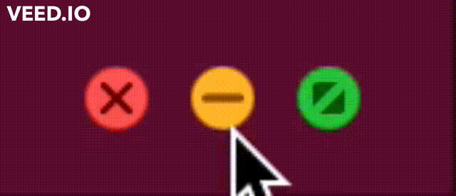
To mimic these we'll make a button, give it a circle background (with the appropriate background-color), and on hover show the icon within it.
// styles that are applied to the svg element
const iconStyles = {
width: '12px',
height: '12px',
viewBox: '0 0 12 12',
fill: 'none',
xmlns: 'http://www.w3.org/2000/svg',
};
// styles that are applied to the ICON svg element
const hoverStyles = {
position: 'absolute',
opacity: 0,
transition: 'ease-in-out',
transitionDuration: '100ms',
_groupHover: { opacity: 1 },
};
// helper component to help you understand
const Icon = ({ children, ...props }) => (
<svg {...props}>
{children}
</svg>
)
// close icon
<>
<Icon {...iconStyles}>
<circle cx="6" cy="6" r="6" fill="#FF4A4A" />
</Icon>
<Icon {...iconStyles} {...hoverStyles}>
<path
opacity="0.5"
d="M6.70432 5.99957L8.85224 3.85634C8.9463 3.76227 8.99915 3.63467 8.99915 3.50163C8.99915 3.36859 8.9463 3.241 8.85224 3.14692C8.75818 3.05285 8.63061 3 8.49759 3C8.36456 3 8.23699 3.05285 8.14293 3.14692L6 5.29515L3.85707 3.14692C3.76301 3.05285 3.63544 3 3.50241 3C3.36939 3 3.24182 3.05285 3.14776 3.14692C3.0537 3.241 3.00085 3.36859 3.00085 3.50163C3.00085 3.63467 3.0537 3.76227 3.14776 3.85634L5.29568 5.99957L3.14776 8.14281C3.10094 8.18925 3.06378 8.24451 3.03842 8.30538C3.01306 8.36626 3 8.43156 3 8.49752C3 8.56347 3.01306 8.62877 3.03842 8.68965C3.06378 8.75052 3.10094 8.80578 3.14776 8.85222C3.19419 8.89905 3.24944 8.93622 3.31031 8.96158C3.37118 8.98694 3.43647 9 3.50241 9C3.56836 9 3.63365 8.98694 3.69452 8.96158C3.75539 8.93622 3.81063 8.89905 3.85707 8.85222L6 6.70399L8.14293 8.85222C8.18937 8.89905 8.24461 8.93622 8.30548 8.96158C8.36635 8.98694 8.43164 9 8.49759 9C8.56353 9 8.62882 8.98694 8.68969 8.96158C8.75056 8.93622 8.80581 8.89905 8.85224 8.85222C8.89906 8.80578 8.93622 8.75052 8.96158 8.68965C8.98694 8.62877 9 8.56347 9 8.49752C9 8.43156 8.98694 8.36626 8.96158 8.30538C8.93622 8.24451 8.89906 8.18925 8.85224 8.14281L6.70432 5.99957Z"
fill="black"
/>
</Icon>
</>
// minimize button
<>
<Icon {...iconStyles}>
<circle cx="6" cy="6" r="6" fill="#FFB83D" />
</Icon>
<Icon {...iconStyles} {...hoverStyles}>
<path
opacity="0.5"
fillRule="evenodd"
clipRule="evenodd"
d="M2 5.7C2 5.3134 2.35817 5 2.8 5H9.2C9.64183 5 10 5.3134 10 5.7C10 6.0866 9.64183 6.4 9.2 6.4H2.8C2.35817 6.4 2 6.0866 2 5.7Z"
fill="black"
/>
</Icon>
</>
// maximize button
<>
<Icon {...iconStyles}>
<circle cx="6" cy="6" r="6" fill="#00C543" />
</Icon>
<Icon {...iconStyles} {...hoverStyles}>
<g opacity="0.5">
<path
d="M7.90909 3L3 7.90909V4C3 3.44772 3.44772 3 4 3H7.90909Z"
fill="black"
/>
<path
d="M4.09091 9L9 4.09091L9 8C9 8.55228 8.55228 9 8 9L4.09091 9Z"
fill="black"
/>
</g>
</Icon>
</>
Make the buttons functional
You've got some awesome new icons for both Windows and macOS, but they don't do anything yet. Now let's connect these buttons to Electron to handle the minimizing, maximizing, and closing of our app.
Firstly, you'll need to wrap your icons with a button element to make them clickable.
Secondly, you'll need to add an onClick to your button like in the example below.
type TitlebarButtonProps = {
message: "minimizeApp" | "maximizeApp" | "closeApp";
children: ReactNode;
};
const TitlebarButton = ({ message, children }: TitlebarButtonProps) => (
<button
onClick={() => {
window.electron.ipcRenderer.sendMessage(message, [message]);
}}
>
{/* children would be one of your icons */}
{children}
</button>
);
Lastly, you need to pass a message prop to your TitlebarButton component.
<Titlebar message="minimizeApp">
{/* Windows or macOS minimize app icon here */}
</Titlebar>
Connect your frontend to your Electron process
After creating some buttons you might be asking what is the ipcRenderer.sendMessage function in onClick actually doing.
ipcRenderer provides a way for you to communicate between your main and renderer processes. You can read more about it on Electron's ipcRenderer page.
So in our case, we want to send a message to the main process of Electron that we want to minimize, maximize, or close the app. Now that we're sending a message to the ipcRenderer within the TitlebarButton component, we need to read and act depending on the message in our main.ts file.
If you go toward the bottom of the file, you can update the last app function to the following:
app
.whenReady()
.then(() => {
createWindow();
ipcMain.on("minimizeApp", () => {
mainWindow?.minimize();
});
ipcMain.on("maximizeApp", () => {
if (mainWindow?.isMaximized()) {
mainWindow?.unmaximize();
} else {
mainWindow?.maximize();
}
});
ipcMain.on("closeApp", () => {
mainWindow?.close();
});
app.on("activate", () => {
// On macOS it's common to re-create a window in the app when the
// dock icon is clicked and there are no other windows open.
if (mainWindow === null) createWindow();
});
})
.catch(console.log);
Now since we're using Typescript, we'll need to add/update types to satisfy some type warnings.
Inside your preload.ts file, update your Channels type to the following:
export type Channels = "minimizeApp" | "maximizeApp" | "closeApp";
To take this full circle now, you should notice below the Channels type, the following:
contextBridge.exposeInMainWorld("electron", {
ipcRenderer: {
sendMessage(channel: Channels, args: unknown[]) {
ipcRenderer.send(channel, args);
},
},
});
This puts electron.ipcRenderer.sendMessage on your window object and that is how on a Titlebar button click, Electron knows what to do.
Wrap up
That's it for part 1 of how to build a custom titlebar for Electron in a React app. In part 2, we'll see what else we can customize in the titlebar.